
This DPS layout looks elegant and stylish, the use of white space emphasises the red typeface. The difference in size of typeface and colour creates a creative look, indicating the publication being about design.

I like the way the typeface varies within the same sentence, this is through use of colour, font and the alignment of the type. I could potentially use this technique as an influence when designing my DPS.

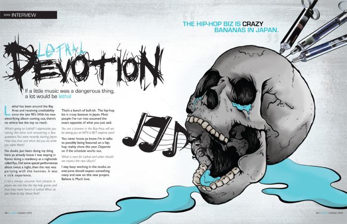

I like the way the typeface varies within the same sentence, this is through use of colour, font and the alignment of the type. I could potentially use this technique as an influence when designing my DPS.